Warehouse Winery Label Stocked With Treasure
 Warehouse Winery, located in St. Louis Park, Minnesota, opened its doors in 2009 in a true industrial warehouse district. On each bottle of Warehouse wine is the image of a gopher, a tribute to the winery owner’s father who gave him the former “Gopher Motors” warehouse that became the winery. Now a building that was once used to rebuild 80 engines a day is producing over 7,000 gallons of wine per year.
While many wineries can rely on tasting rooms to attract customers, Warehouse Winery does not have regular weekly business hours and instead relies on their unique packaging, and their wine, to make the sale. According to Nick Lundsten, marketing and events director, Warehouse Winery is only open for private events and parties, plus quarterly public wine tastings. The bulk of their sales are through self distribution to 50 retailers, 32 restaurants, plus online purchases.
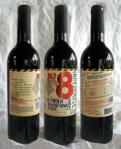
The goal for Graphic designer Cori Mueffelmann and long time friend and Warehouse Winery owner, Billy Smith, was to create a label that communicates the warehouse concept of the winery. This goal was accomplished by designing the label in the style of an old-fashioned packing slip. Using an antique shipping manifest as the theme also provided ample space for a wide range of information about the winery. Information on the label includes the style of the wine, the blend of grapes, production methods, and contact information for wine tastings and tours. There’s also a personalized message from Smith on each bottle about his “journey of passion” into the wine business.
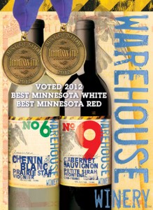
 In many respects, the plethora of information on the label resembles multi-faceted history of “Renaissance man” winemaker and winery owner Billy Smith. During his career, Smith has been a sculptor, photographer, potter, an industrial real estate developer and property manager. Now his urban winery has won over 20 wine awards in three years.
Although Warehouse labels contain a lot of data, the most distinctive feature is the large number on the front, usually in a primary color. According to designer Mueffelmann, the numbers began as a way to keep track of the order in which the wines were released. But in a great example of the importance of listening to your customers, Warehouse employees noticed that clients eschewed the varietal names on the label and instead referred to the number. Now numbers are used to reference each wine and the size of the numbers on the label has increased to become the focal point.
Varietal and varietal blends are also included on all the Warehouse Winey labels. The typeface used for the varietal information is a departure from the typical Midwestern wine label which often use script and serif fonts. Instead, the designer chose sans-serif fonts specifically to communicate the vintage warehouse look and the brand story. Similarly, the faded colors of the varietal type also have a hand stamped “faded with age” look. Replicas of postage stamps were added to the label to continue with the packing slip motif and add a colorful accent.
On the front of the label is a raven who, according to Mueffelmann, has been a recurring personal symbol for Smith throughout his various pursuits. Upon closer inspection, a viewer will notice that in the raven’s talons are grapes, a reference to the biblical story about stealing grapes from the vineyard.
A primary goal for Smith is to be transparent with the blend information and reveal some of the mystery of the winemaking process, Mueffelmann said. Warehouse Winery often blends Minnesota cold climate grapes with selected varietals from Northern California. Listing the blend information highlights the winery’s support of Minnesota grape growers, she said. (Smith planted 400 cold climate Marquette grape vines in his front yard that were used to make his first wines.)
The Warehouse Winery Number 8 label was digitally printed on an HP Indigo in four-color process plus an opaque white ink onto a silver poly material. The absence of opaque white behind some of the design elements, like the red Number 8, creates a metallic ink effect. Color-Logic Gradation-FX was used to achieve the graduated color appearance of the Syrah, Frontenac and Merlot. Finally, the labels were finished with a matte UV varnish.
The printing was done by Flexo Impressions, located in Savage, MN and is part of Taylor Corporation. They serve wine customers in all parts of the United States.
[wp_geo_map]


1 Response
[…] has won over 20 wine awards in three years. For a full review of this wine label, read the article “Warehouse Label stocked with Treasure” I wrote for Midwest Wine […]