St. James Chambourcin Label Profile
St. James is Missouri’s largest winery, producing over 200,000 cases per year. Because St. James’ wine is distributed to retail stores in 17 states, packaging is an important marketing consideration according to marketing manager Ann Miller.
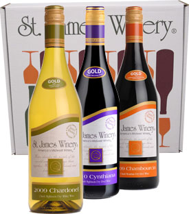
 Chambourcin, a top-selling red wine at St. James, is supported by both novel labeling and imaginative packaging. St. James Chambourcin is sold both by the bottle and as part of a packaged set of “three C’s” — Chambourcin, Cynthiana, and Chardonel. Selling wine in a three pack motivates consumers who already like one or two of the wines to make the jump and buy three wines at once, Miller said.
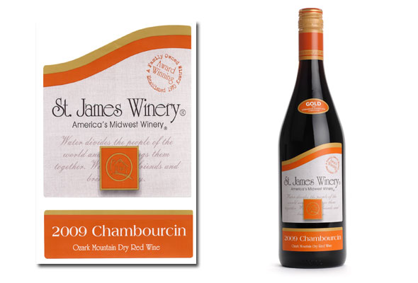
A prominent feature of the St. James’ Chambourcin wine label is the curving “swoop” die cut shape that is used on many St. James labels. Bob Cantwell, of Cantwell Design Works in Leslie, Missouri, the designer who has worked with St. James for 25 years, said the “swoop” has been used for about ten years and reflects two concepts. The first is an abstraction of the nearby Meramac River. The second concept the swoop design conveys is forward thinking or forward movement.
When Miller initially met with Cantwell to discuss the Chambourcin label, she said her design objectives were to appeal to Baby Boomers, convey the quality of the wine and have a contemporary, clean look. Miller also wanted the colors of the label to match St. James’ new twist off capsules.
Besides the swoop, another important element that makes St. James Chambourcin stand out is the color choice of orange. For many years the color orange on any product was considered taboo. However, after attending the international meeting of The Color Marketing Group, Cantwell learned that orange was forecast to have increasing value and appeal. Plus, the color orange “pops” on a retail shelf and is in the same warm color family as the red hue of wine.
The color orange is smartly focused on the most important label elements that wine producers want possible buyers to notice. On the St. James label, the varietal and description- 2009 Chambourcin, Ozark Mountain Dry Red Wine- are all reverse orange. Having this description on the front of the label helps consumers who are not familiar with Midwestern wine relate it to what they do know – Dry Red.
Article continues below photo.
In addition, a sticker reading “Gold 2009 International Eastern Wine Competition,” is strategically placed on the shoulder of the bottle, giving the wine additional credibility. The third element is the swoop that outlines the die cut and is repeated on many St. James labels.
Two additional orange elements are the twist off wine capsule and the St. James Winery logo. According to the St. James Winery website, ‘The St. James Winery logo, a schoolhouse, honors the Italian settlers who first planted grapes here in Missouri. The original schoolhouse built to educate their children still stands today and is adjacent to the winery’s vineyards.”
Lastly, credibility is enforced again with orange text stating, ‘Award Winning; A Family Owned Winery; Established 1970″ in an area of the label created by the swoop that would have been white space.
The Chambourcin wine label was printed by Ample Industries. They produce labels for over 150 wineries, primarily in the Midwest and print both digitally and conventionally. The St. James Winery Chambourcin label was Flexo printed in a four color process with several spot colors and finished with a matte UV.
Rebecca is the owner of Bauerhaus Design, which specializes in building brands for Midwestern wineries. For more information visit Bauerhaus Design at www.bauerhaus.com
[wp_geo_map]


