Cedar Ridge Clear Label Wins Awards
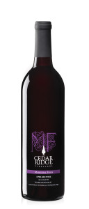
Cedar Ridge Vineyards, a family-owned winery and distillery located between Cedar Rapids and Iowa City, Iowa, is no stranger to the lime light. Cedar Ridge received 20 awards for their wines in 2012 and more than 12 wine label design awards since 2008 at the Mid-American Wine Competition. In particular, their estate-grown Marechal Foch wine won two Silver medals for both wine label typography and the vintage.
When proprietor and wine maker, Jeff Quint, started Cedar Ridge in 2005, their focus was on making unique hand crafted wines from the vines they planted on the steep hills surrounding the winery. Now the vineyard has grown to over 5,000 vines. In addition, Cedar Ridge has a 7,000 square foot winery, distillery, tasting room and event center.
Like Cedar Ridge Vineyards founder Jeff Quint focuses on creating handcrafted wines, designer Matt Kempel also focuses on creating, ‘unique and economical packaging designs reflecting the handcrafted and boutique nature of the Cedar Ridge brand.” Printing on clear labels to emphasizes the purity and quality of the wine while providing a media to create eye grabbing graphics.
According to Jamie Siefken, General Manager at Cedar Ridge, part of their success as a winery is due to the high quality design of their wine labels. ‘There have been a lot of studies that prove that wine revenues are dependent on wine labels, especially in the U.S. In my opinion this holds true in Iowa. Many wineries in the state try to save money on labels, however this is the best type of marketing you can do for your wine.”
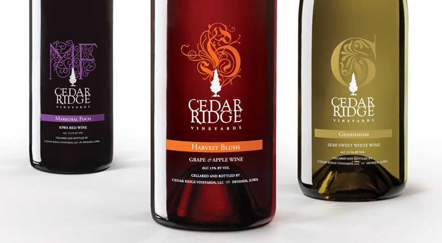
Each of the Cedar Ridge wines showcase a custom lettered initial of the wine varietal. Siefken explains that using the varietal name for the name of the wine, helps ‘increase the level of awareness when it comes to the cold climate hybrid grapes that are grown here in Iowa.” Plus, the majority of the type on the wine labels was created just for Cedar Ridge.
See related story: What’s in a Wine Name Anyway
Matt Kempel, the designer at Fuel Inc., utilized typography and color to create distinction and emphasize the personality of the wines. The Marechal Foch lettering was created in a floral organic style to reflect the French origins of the grape used in the wine.
Likewise, the purple color of the Marechal Foch label, ‘was chosen to fit in with the family of Cedar Ridge wines, but specific considerations in the color selection included the name, style of wine, variety of grape and color of the bottle,” says Kempel.
I counsel winery clients that in order for a wine label to be successful it must work on several levels. One, it must grab the shopper’s attention from down the aisle. Secondly, the label must be intriguing enough that someone wants to pick it up. Then, on closer inspection, the label must continue the brand story.
In the case of Cedar Ridge, the Marechal Foch label’s simplicity and elegance draws you in, while the clear label makes it stand out even further from all the other wine bottles.
 Plus, on closer inspection, viewers are drawn to the Cedar Tree silhouette logo which originated from the ridge of native Cedar trees found at the vineyards. Kempel created the tree icon to be a natural extension of the experience of being on the vineyards. A good logo, like this one is: simple, easy to read, memorable, scalable, relevant to your audience and part of a larger brand.
The labels were printed by Morgan Meredith, Inc. in Cedar Rapids. Tracy Karnes of Morgan Meredith said the labels are made of clear polypropelene, then attached to the bottle. This process creates a similar appearance to direct imprinting but at is faster and generally less expensive than printing directly on the bottle. “The designer and the client we’re going for a look that says ‘we are not trying to hide anything’ and the label conveys an image of purity and quality,” she said.


1 Response
[…] at the Mid-American Wine Competition. In particular, their estate-grown Marechal Foch wine won two Silver medals for both wine label typography and the […]