What Your Wine Label is Trying to Tell You
A wine label should communicate your brand, your uniqueness and increase the perceived value of your wine. A wine label is your biggest piece of advertising and the first contact most people will have with your wine. You only have seconds to get the attention of a consumer and you want make a positive first impression. Is your label communicating the proof of your wine’s value?
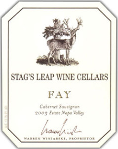
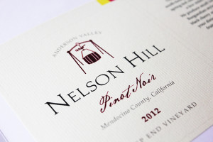
At a recent Illinois Grape Growers and Vintners Association Winemaker’s Bootcamp, I showed a slide of two different wine label designs. Every person in the room correctly guessed the more expensive wine based only on the wine label design.
 But how could everyone know which wine was more expensive based solely on the label? Had they all purchased the $90 per bottle wine before? Of course not. We are all able to make value decisions based on the way our brains unconsciously perceive design.
According to the book Unconscious Branding, our senses take in about 11 million bits of information every second, but we are only consciously aware of about 40 bits of that information. This means that our brains take short cuts based on past experiences.
When we see a wine label design, our brains instantly decide which wine costs more based on subtle design cues which we’ll describe in more detail later.
Despite what we know about how people process information, wine label design is both an art and a science. There is no scientific formula for predicting what is going to make your wine fly off the shelves, but there are strategic design steps a winery can take to increase retail price points.
First, instead of creating a random wine label, think about how your winery is different and promote that key brand strategy through your wine label.
What are some ways a winery can be different? The most successful wineries in the United States differentiate their brands in three ways. One strategy is to focus on a specific varietal. For example, the wine brand Mark West Pinot Noir was sold recently for $160 million, just for the brand name alone. The millions of dollars that Constellation Brands paid for Mark West did not even include the vineyards or winery.
The second way a winery can stand out is to focus on the personality of the winery owner or winemaker. Some winery owners have very unique personalities or have an interesting founding story. For example, the Bonny Doon Vineyards label is a great example of an eccentric owner relaying this story with whimsical art and typography.
The third way a winery can differentiate itself is by focusing on their location. Does your winery have a beautiful view, a distinctive building or are you in a specific and well known AVA? If so, promote it on your wine label design.
Another key consideration when designing your wine label is your target consumer and how they shop at a retail store. Is the purchase decision for your wine is based on a varietal, price, region or occasion?
This past week I had the pleasure of helping judge the 2014 Illinois State Fair wine packaging competition. The panel at the packaging competition included Jacob Thornton, a sales associate at the Springfield Illinois wine retailer, Corkscrew. Thornton brought up that customers at Corkscrew often state their intentions voluntarily. Examples of consumer wine preferences include: ‘I want a sweet wine” or ‘I want a gag gift” and still others shop by naming a specific varietal.
Knowing what your wine consumer is shopping for helps determine if you need to highlight the varietal for a traditional consumer or if you should be non-traditional to hit Millennials. Knowing the brand strategy and core wine consumer that is going to purchase the bottle makes the designers job much easier in creating a wine label that will increase sales.
In a retail setting, a wine label needs to work on three levels. First it needs to catch your attention across the aisle. This can be achieved through colors cues that represent the taste of the wine or through an eye-catching icon or piece of artwork.
Second, it needs to catch your interest at arm’s length. This is where your brain picks up minute design details that signal “this is a quality wine.”
For instance, at arm’s length the eye registers textured paper, foil, and embossing. This is the distance where type style choices come into play; whether a font is a traditional- on higher priced wines- or a whimsical font on lower priced wines.
And finally the eye scans for “negative space” and for a clear, organized hierarchy of information. All of these elements together tell our brains that this wine will be a quality, hand crafted wine, in keeping with the wine label.
The third way a wine label needs to work is at home. The wine consumer takes a drink, loves the wine and wants to find out more about your wine brand. Where do they turn? Of course, the consumer turns to the back of the wine bottle. This is your opportunity to tell your brand story, whether it is about the varietal, the owner or winemaker, or about your location.
How do you know if your packaging missed the mark? To learn how consumers view your packaging, observe the consumer’s behavior, don’t ask them to tell you. A Professor at UCLA found that 7 percent of personal communication is derived from words, 38 percent from the tone of voice and 55 percent from the facial expression or body language.
Your wine label can be the first contact consumers have with your winery. What does your label say about your wine quality and wine story?
Rebecca is the owner of Bauerhaus Design, which specializes in building brands for wineries. Get more winery customers with our 7 Free Wine Marketing Tips and learn how to sell more wine with a powerful brand, email marketing, social media, online ads and more: www.bauerhaus.com/sell-more-wine/


